Light or dark: which background suits your photos?
Folio Team
A photo on a screen is never seen alone. There is always a page around it, and the page takes up more of the screen than most people realize. Whatever color it is, your photos get judged against it.
That makes the background one of the few design choices that changes how the work itself looks. The same file can look brighter or darker, richer or flatter, depending on what sits next to it. Neither light nor dark is the better choice in general. It depends on the photos.
What the page does to a photo
Eyes judge brightness by comparison. Put a mid-gray square on a white sheet and it looks dark. Put the same square on black and it looks pale. Nothing about the square has changed.
A photo behaves the same way. On a white page, the page is the brightest thing in view, so everything in the photo looks a little darker beside it. On a dark page, the photo becomes the brightest thing in view, and it looks lighter and more luminous.
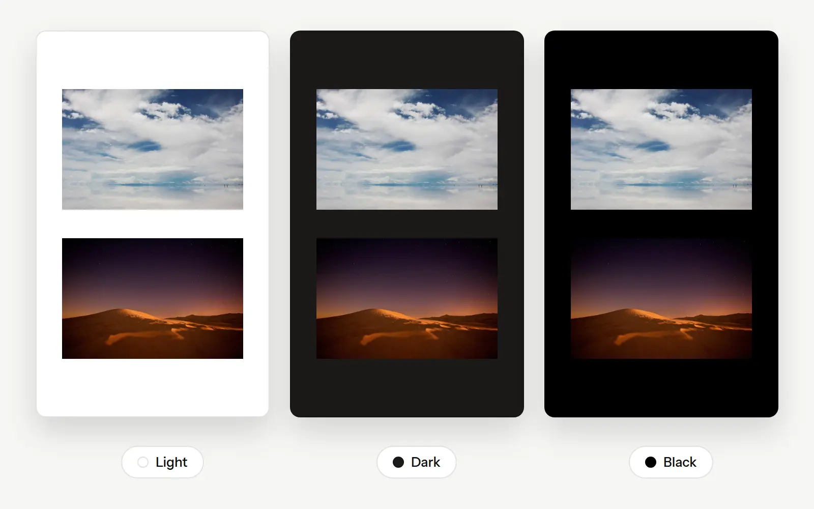
Look at the edges as well. The pale lower edge of the bright photo nearly merges with the white page, and the dark photo starts to lose its outline on black. We'll come back to that.
A light page
White is the page most people expect. It is the color of paper, of a mat around a print, and of most gallery walls, and it tends to read as open, clean and calm.
It suits work that is bright to begin with: daylight weddings, families, newborns, food, interiors, products, and travel shot in open light. Text is easy to read on it, which matters if your galleries carry descriptions or captions. It is also the closest preview of how a photo will look printed and matted.
White is harder on dark photos. Shadows look heavier beside a bright page, and detail you worked to keep in them gets harder to see. A night scene or a low-key portrait can end up as a dark block with a glare around it, especially for someone looking at a phone in a dim room.
A dark page
A dark charcoal page steps back. With less light coming from the page, the eye goes to the photos, and colors tend to look richer against it. This is the same reason a cinema dims the lights.
It suits low-key and moody work: concerts, night streets, astrophotography, studio portraits on dark backdrops, and anything edited with deep, quiet tones. Shadows open up, because the photo is no longer competing with a page brighter than itself.
The cost is in bright photos and in mood. A high-key image can look harsh against a dark surround, like a lit window in a dark room. And a dark page carries a feeling of its own. It can read as dramatic or serious, which is not always what a couple browsing wedding photographers is hoping to feel.
True black
Black is a stronger version of dark. With no visible page at all, the photos seem to float, and on phones with OLED screens the black areas give off no light whatsoever. For a set of night photos viewed in the evening, nothing else looks quite like it.
It is also the least forgiving of the three. Very few photos contain a pure black, so the darkest part of a photo is usually a little lighter than a black page. Next to it, shadows that looked deep on white can look gray or hazy. Edits with a matte or faded look show this the most.
White text on pure black is also tiring to read at length. If a gallery has more than a line or two of writing, charcoal is usually the more comfortable of the two.
Watch the edges
A photo needs an edge. When the background is close in tone to the outer parts of the photo, the frame dissolves and the composition goes with it.
On white, this happens to photos with pale skies, snow, fog or studio white backdrops. On black, it happens to night skies, dark vignettes and low-key portraits. Sometimes that is the effect you want, with a subject emerging from the page. More often it just looks as if the photo has no border and no clear shape.
So check the photos whose edges are closest to the page color. If several of them lose their outline, the background is fighting the work.
Black-and-white photos
Monochrome work shows the effect of the page more plainly than color does, because tone is all there is.
A white page makes the photo's grays look darker and gives the set a crisp, printed feel. A black page lifts the highlights and makes them glow, and it exposes any shadow that isn't quite black. Charcoal is a good middle for a set that mixes high-key and low-key frames.
One more thing to check: if your black-and-white photos are toned warm or cool, a pure white or pure black page will make the tint more visible. That may be what you want, or it may make the set look inconsistent.
Think about where it will be seen
A lot of visitors will open your portfolio on a phone, often in the evening. A white page at full brightness in a dark room is uncomfortable, and a black page in bright sunlight turns the screen into a mirror. You can't control either case, but it's worth knowing which one is more likely for your clients.
Think about what they expect, too. People looking for a wedding or family photographer have mostly seen light, airy sites. People looking for a concert or automotive photographer have mostly seen dark ones. You don't have to follow the convention, but going against it should be a choice.
One background or several?
A portfolio that changes color from page to page feels unsettled, so pick one background for the portfolio as a whole and let it be part of how your work is recognized.
A single gallery can be the exception when the work calls for it. If most of what you shoot is daylight portraiture and one project was shot entirely at night, that project can have a dark page of its own. Visitors read it as a deliberate change of mood, as long as it happens once or twice and not on every gallery.
A quick test
If you're still undecided, this takes about ten minutes:
- Pick your three brightest photos and your three darkest.
- Look at all six on each background, on a laptop and on a phone.
- For each background, find the photo that suffers most.
- Choose the background whose worst case you can live with.
The test is about the weakest result because a background that flatters your best photo and spoils three others is a bad trade. If two backgrounds come out even, pick the one that matches the larger share of your work.
It also helps to narrow the set down first. A portfolio that is consistent in tone is much easier to find a background for.
Themes in Folio
Folio has three themes for public pages: Light, Dark and Black. Light is a white page, Dark is a soft charcoal, and Black is a true black.
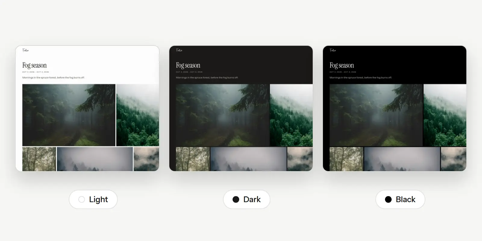
A gallery uses your portfolio's theme unless you give it one of its own, so the one-off dark gallery described above is a setting in that gallery's Presentation panel. Choosing a theme for a gallery is free on every plan. Changing the theme of the whole portfolio is part of custom branding on paid plans, and the details are on the pricing page.
Visitors see the theme you chose, whatever their own device is set to, so the page you tested is the page they get.